Typography and Headings
Definition
Typography provides guidelines for consistent and coherent use of fonts, text styles, and typographic elements across platforms, ensuring alignment with the brand identity. Typography includes fonts, headers, body copy, line height, and weights that hold together as a system and take into account accessibility, responsiveness, and design.
Headings are text elements used to organize content; they are critical parts of a webpage that provide important information for search engine optimization, user experience, accessibility, and usability.
Usage and Specifications
Fonts and Sizes
Columbia Design System uses the following fonts and sizes:
Font Stacks
The following font families are used across omni- and multichannel digital products. These are not alternative fonts.
Text Styles
Headings (H1-H6) and other text styles improve readability and aid scanning by creating structural and visual hierarchy. They are also important opportunities for accessibility compliance and search engine optimization.
Text Style Sizes
Headings should be used in a specific order to be most useful and to comply with the university accessibility standard. Here’s how to use them correctly:
- Use only one H1 per page as the page title or headline.
- Headings should be an outline for the content on the page.
- Always use them in descending order (H1, H2, H3, H4, etc.), such that H2s follow the H1, H3s follow H2s, etc., within a section. Pages can have multiple sections.
Using headings out of order can confuse screen readers, which then read the content out of order, as well as search bots, which can damage SERPs.
There are eight different HTML tags that work as landmarks: <main>, <header>, <footer>, <nav>, <form>, <section>, <aside>, and <search>. Each has a corresponding ARIA role. Take this and other text styles—accordion headers, subheads for cards and other graphic elements, etc.—into consideration when planning the structural hierarchy of your project. We also recommend:
- Use H2 for major section headers
- Use H3 for accordion and graphic element subheaders
- Font weight: varies
- Colors
- Black: #222222
- White: #ffffff
- Blue: Pantone 287; #003087
- Orange: Pantone 718C; #C75000
Important to Note: All text (foreground) and background color combinations must meet the minimum contrast requirements of the university accessibility standard. Check your color choices with the WebAIM contrast checker.
Examples of Do's and Dont's
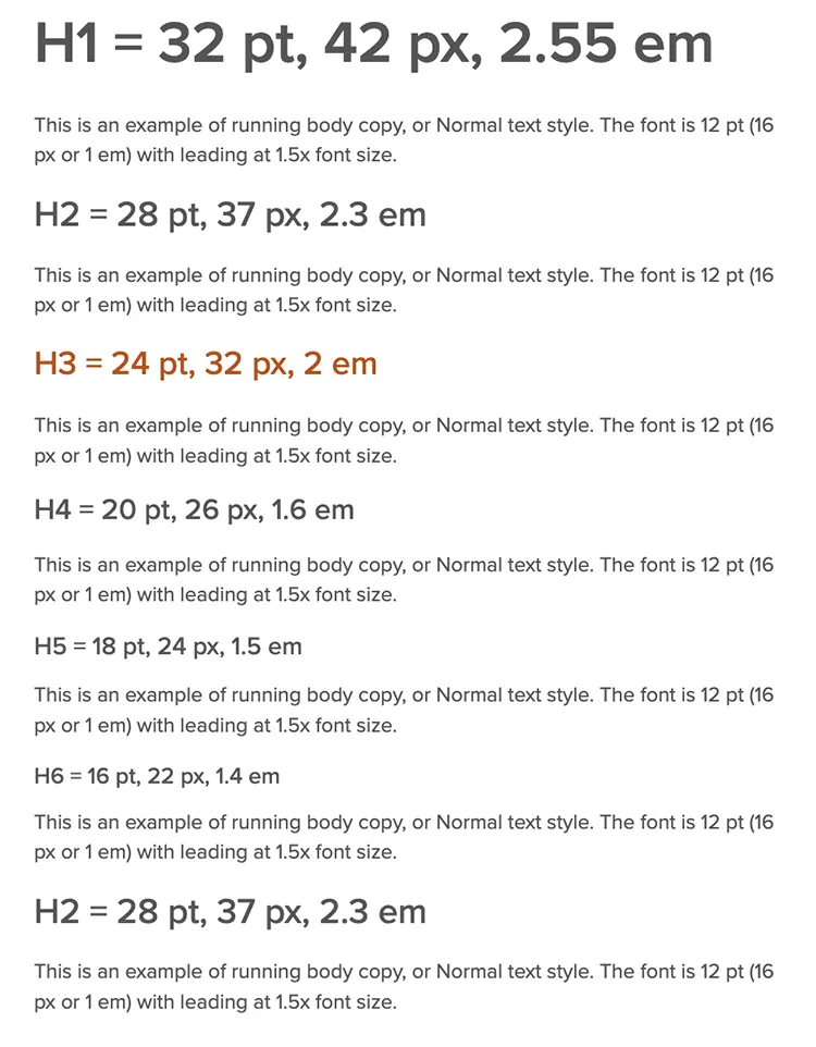
Here is an example of the correct ordering of H1 through H6 headings.
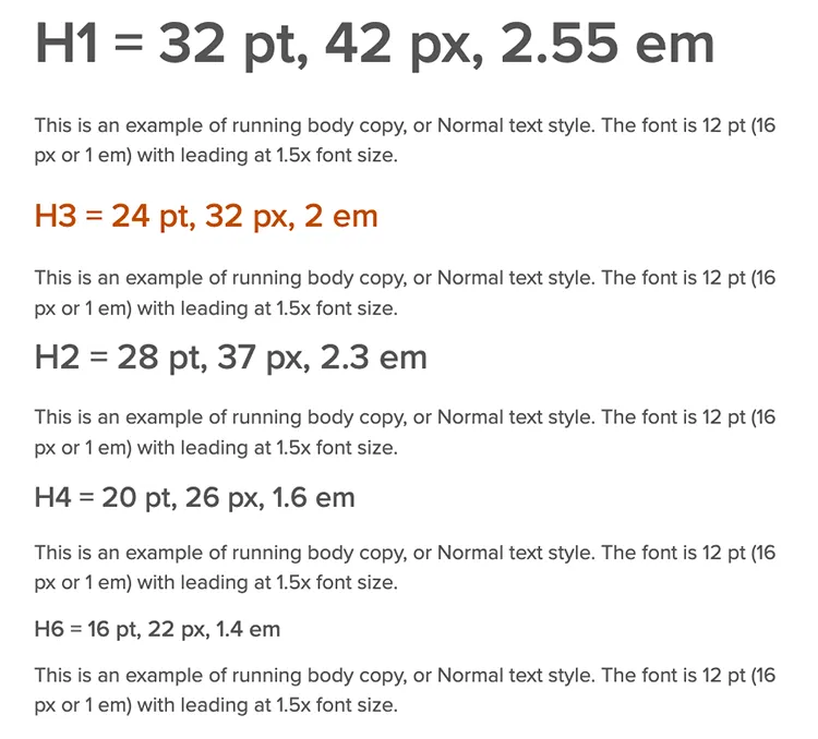
Here is an example of incorrectly ordered H1 through H6 headings.